2. Colour and typography

Colour
The official palette only, with exactly two additions, both flagged.
The theme uses the official co-branding palette: the brand blue, black, white and three greys. The two additions are a secondary dark blue the university already uses on the web, and a focus-ring colour for accessibility. Every other neutral is a derived tint of the official light grey, so it traces back to the palette rather than being an arbitrary shade.
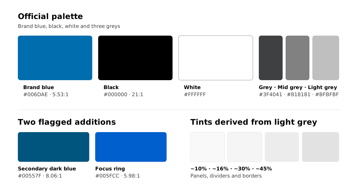
Every pair was checked against the WCAG relative-luminance contrast formula. AA asks for 4.5:1 for normal text, and 3:1 for large text and interface components.
| Token | Value | Role | Contrast |
|---|---|---|---|
--monash-blue | #006DAE | Headings, links, accent, card hover | 5.53:1 |
--monash-blue-dark | #00557F | Link hover, deep accents | 8.06:1 |
--body-text | #000000 | Body copy | 21:1 |
--muted-text | #3F4041 | Captions, meta, credits | 10.4:1 |
--mid-grey | #818181 | Decorative only, never text | 3.9:1 |
--surface-pale | #F9F9F9 | Panel background | 19.9:1 |
--focus-ring | #005FCC | Keyboard focus indicator | 5.98:1 |
Note
There is no separate accent colour
The heading underline, quote mark and card rules use the brand blue itself. Earlier iterations tried gold, then the dark blue, but neither is in the official palette, so both were replaced. A blue underline under a blue heading is consistent with the guideline that headings lead with the brand blue.
Typography
Headings are set in Roboto Condensed and body text in Roboto, with Arial as the brand's named fallback, exactly as the co-branding guide specifies. Helvetica Neue is deliberately not first in the stack: it's licensed and missing on most student machines, so it would silently fall back anyway.
- Minimum body size 16px
- Hierarchy from size and the brand underline, at regular weight
- Left-aligned text throughout
- Fonts web-served from Google Fonts, falling back to Arial if they don't load
Two deliberate departures from the brand guide
The co-branding guide gives two instructions aimed at marketing material that weren't applied to the LMS, for usability and accessibility reasons.
Sentence-case headings. The guide asks for uppercase titles. Content headings are full sentences, and forcing them to uppercase reads as shouting, harms readability, and can change screen reader pronunciation.
Rounded corners. The guide shows square buttons. Buttons, cards, wells and dialogs share one radius in the LMS, and squaring only the buttons would break that consistency.
If a brand review requires strict alignment, both are one-line CSS changes.