3. Accessibility and structure

Accessibility
A brand-agnostic accessibility layer, carried over whole, plus a few choices made specifically for this build.
The focus, keyboard, screen reader and reflow layer from reference build A is structural engineering that works with any palette, so it was carried over wholesale. On top of it, each component's behaviour was designed so that keyboard and screen reader users get the same experience as everyone else.
Walkthrough: keyboard behaviour in the three dialogs
Transcript: keyboard behaviour in the three dialogs
The theme has three dialogs: the image lightbox, the transcript you're reading now, and the glossary definition. All three behave the same way.
When a dialog opens, focus moves into it, onto the close button. The Tab key stays inside the dialog while it's open, and the rest of the page is made inert, so it can't be reached with the keyboard and is hidden from screen readers.
Escape, the close button, or a click on the backdrop closes the dialog, and focus goes back to whatever opened it. Each dialog carries a role, is marked as modal, and has an accessible name.
Decisions made for this build
Inline links keep their underline
Colour is never the only cue that separates a link from body text (SC 1.4.1), which the co-branding guide also requires. On hover and focus, the colour deepens to the dark blue and the underline thickens, with no change in font weight, so nothing shifts on the page. Buttons and cards opt out, because their shape and fill already signal that they're clickable.
Quotes are set upright, not italic
The guide limits italics to three to five consecutive words, kept for titles of books, journals and programs. A quote is a full sentence or passage, and long italic runs are harder to read, particularly for dyslexic and low-vision readers.
Keyboard focus is visible, but only for the keyboard
A high-visibility focus ring (#005FCC, 5.98:1) appears on every authored component for keyboard users, but not on mouse click. Canvas's own interface keeps its native focus styling untouched.
Reflow and reduced motion
Every grid reflows to fewer columns on narrow screens (SC 1.4.10). For learners who ask for reduced motion, the banner's loading shimmer and non-essential transitions are switched off.
Structure
Most content rules are scoped to authored content, so Canvas's navigation, sidebars and admin screens are never restyled. A small set of rules deliberately reach outside that scope: the page-width wrappers, the discussion title, the module navigation spacing and the focus layer. These are the intended exceptions to "scope everything".
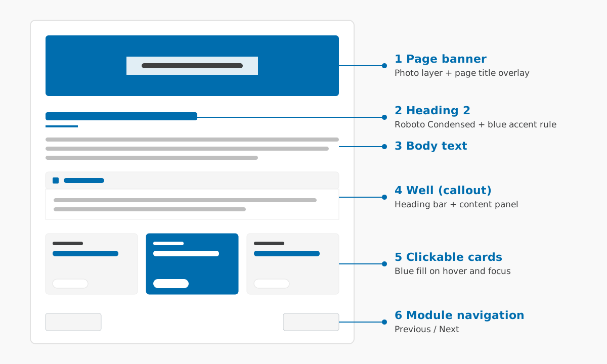
Contracts between the stylesheet and the script
Two behaviours are split across the two files and only work if both sides agree. They're the first thing to re-check whenever either file changes.
- Transcripts degrade safely. The script adds a class to the page body when it loads, and the stylesheet hides the inline transcript only under that class. If the script fails, the transcript stays visible.
- Image zoom is opt-in. Only images an author marks as zoomable get the zoom cursor and become lightbox triggers, so the two files never disagree about which images are interactive.
/* Hidden only when the theme script is running */
body.monash-theme-js .user_content .video-transcript {
    display: none !important;
}
Discussion pages: the one page type without a banner
Canvas's discussions interface renders its title after the theme script has run. When a banner was added, the script would hide the native title but couldn't reliably write the replacement into the banner, so the title disappeared entirely.
The fix removes the failure at source. The title stays in place and is styled in CSS as a brand-blue accent bar, targeting a stable attribute that doesn't change between Canvas releases. It can't fail on timing, it reflows on every screen size, and it can't affect any other page type.